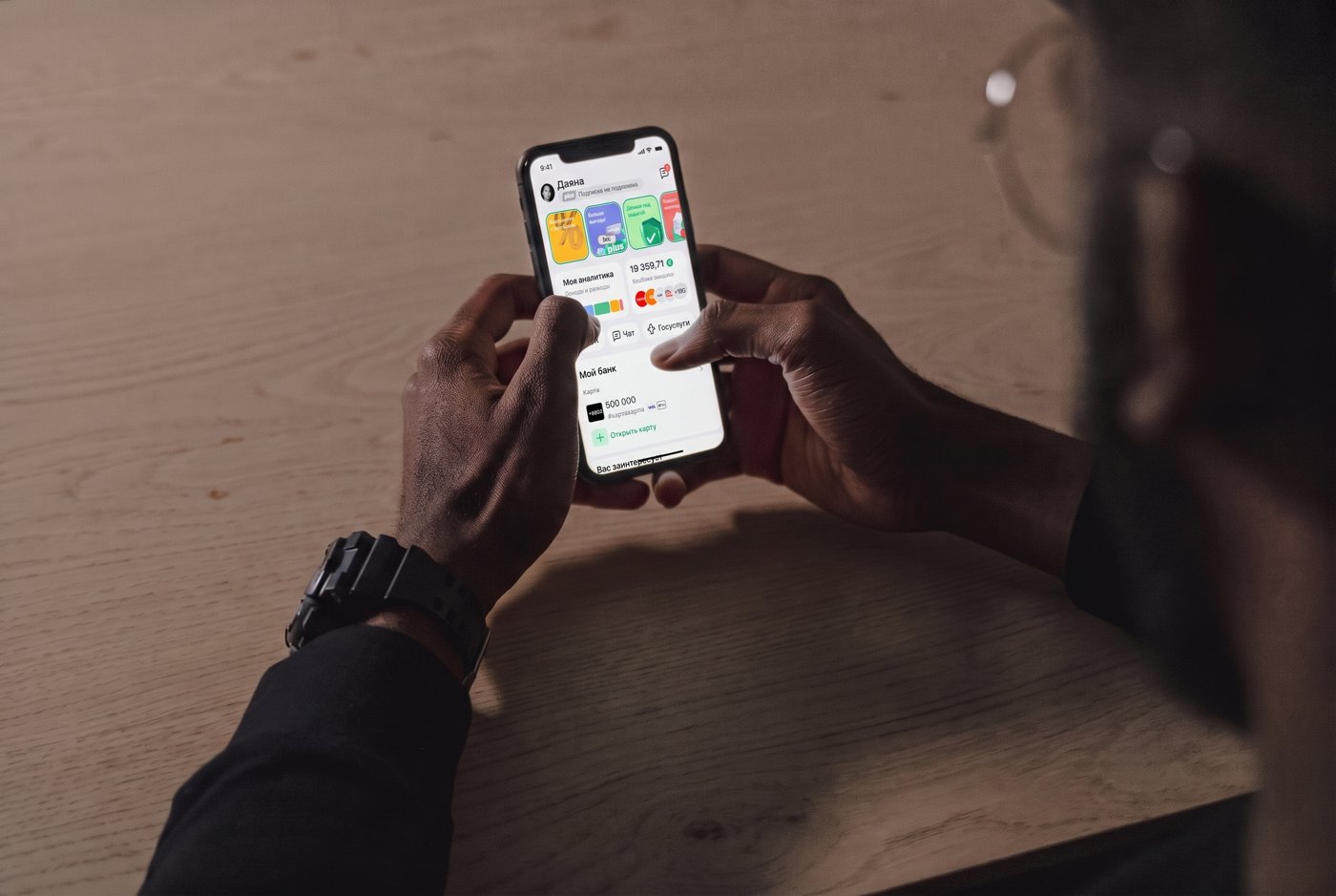
BCC Mobile – Homepage Redesign
Redesigning the first screen every BCC mobile banking user sees – and the main entry point to the bank’s products. Impact: in the first weeks after launch, click-through from Home to product pages grew 2.8× (1.52% → 4.26%).
Low Discoverability
Buried Essentials: Checking balance was pushed below the fold, and cashback was reduced to a flat technical line.
High Stakes: Key retention drivers (cashback) were hidden, requiring an urgent redesign within roughly one quarter.
Context
Qualitative research says: conducted a year ago confirmed the hypothesis that most users overlook the product-opening navigation.
Out of 16 participants in the study: Only 2 of 16 reached products via the Home widget; the rest went through Stories (6) or Services (8).
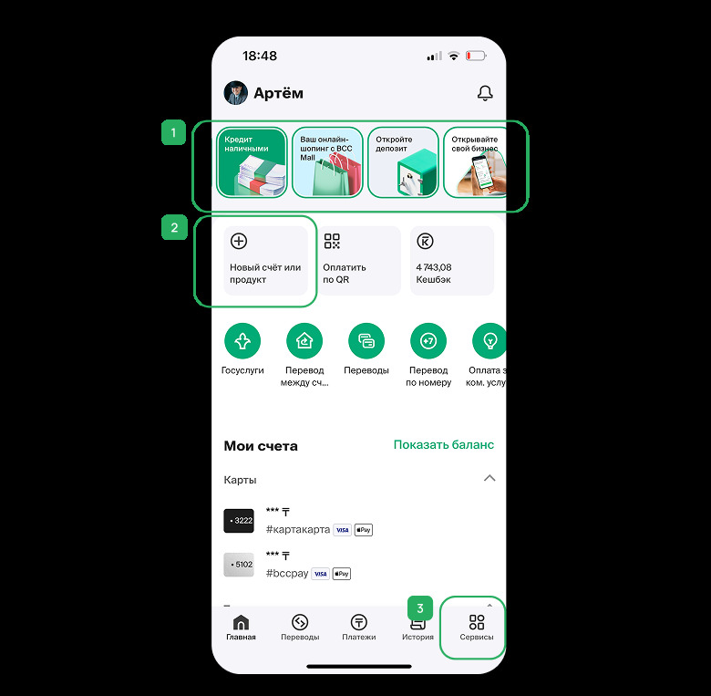
Analytics reveal: that the unusually high traffic for opening new products via the "Services" section is actually driven by the poor visibility of that same feature on the main Home screen, rather than a genuine user preference for that path.
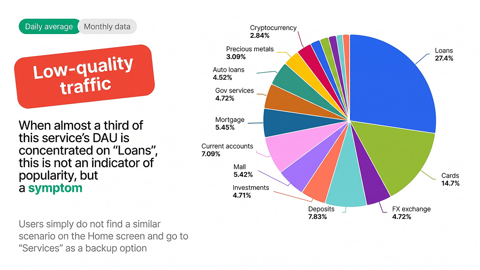
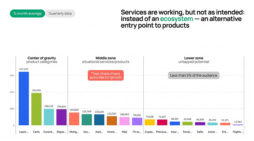
Statistics confirm: In the Services tab, the four biggest product categories (credits, cards, current accounts, deposits) account for ~57% of Services category traffic. This indicates that users are not exploring the "Services" section naturally; instead, they are actively hunting for a way to open a product because they fail to notice the designated "New account or product" button on the main page.
Task
The Homepage redesign sat inside a broader rework of the app’s information architecture (Services and History were redesigned in parallel by teammates); I owned the Homepage. The brief: Rethink the Homepage IA instead of patching the product-opening issue. Design a new personalized PFM widget and redesign how cashback is presented.
Hypotheses
Core bet: the engagement problems were about prioritization, not missing functionality.
- Making product-opening more visually prominent → more users discover and use it on Home instead of Services.
- Raising high-frequency actions (balance) and demoting low-frequency clutter → users complete key tasks faster. Aligned with the product vision: surface the services people come for most often
- Presenting cashback as a personal, rewarding benefit rather than a flat line → it works harder as a retention tool.
Everyday users ignored the old financial tool because it was too complex and generic. Replacing it with a simple, personalized widget fits their actual needs much better.
To keep the Home screen clean long-term, features were moved out into dedicated sections based on what users are trying to do.
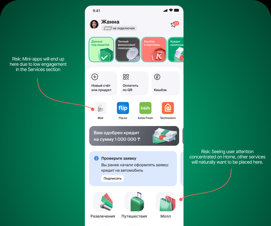
Risk: Mini-apps will end up here due to low engagement in the Services section.
Risk: Seeing user attention concentrated on Home, other services will naturally want to be placed here.
To see their balance or open a product, a user has to scroll one and a half screens.
Job Stories
Architecture
Guided by a single-responsibility principle — each section gets one clear job.
The Homepage’s job: strictly financial — balances, products, key actions; quick control. Anything off-job was deprioritized or removed (e.g., screen-customization was temporarily dropped rather than preserved).
Within that scope, content was split into two thematically distinct widgets instead of one general area:
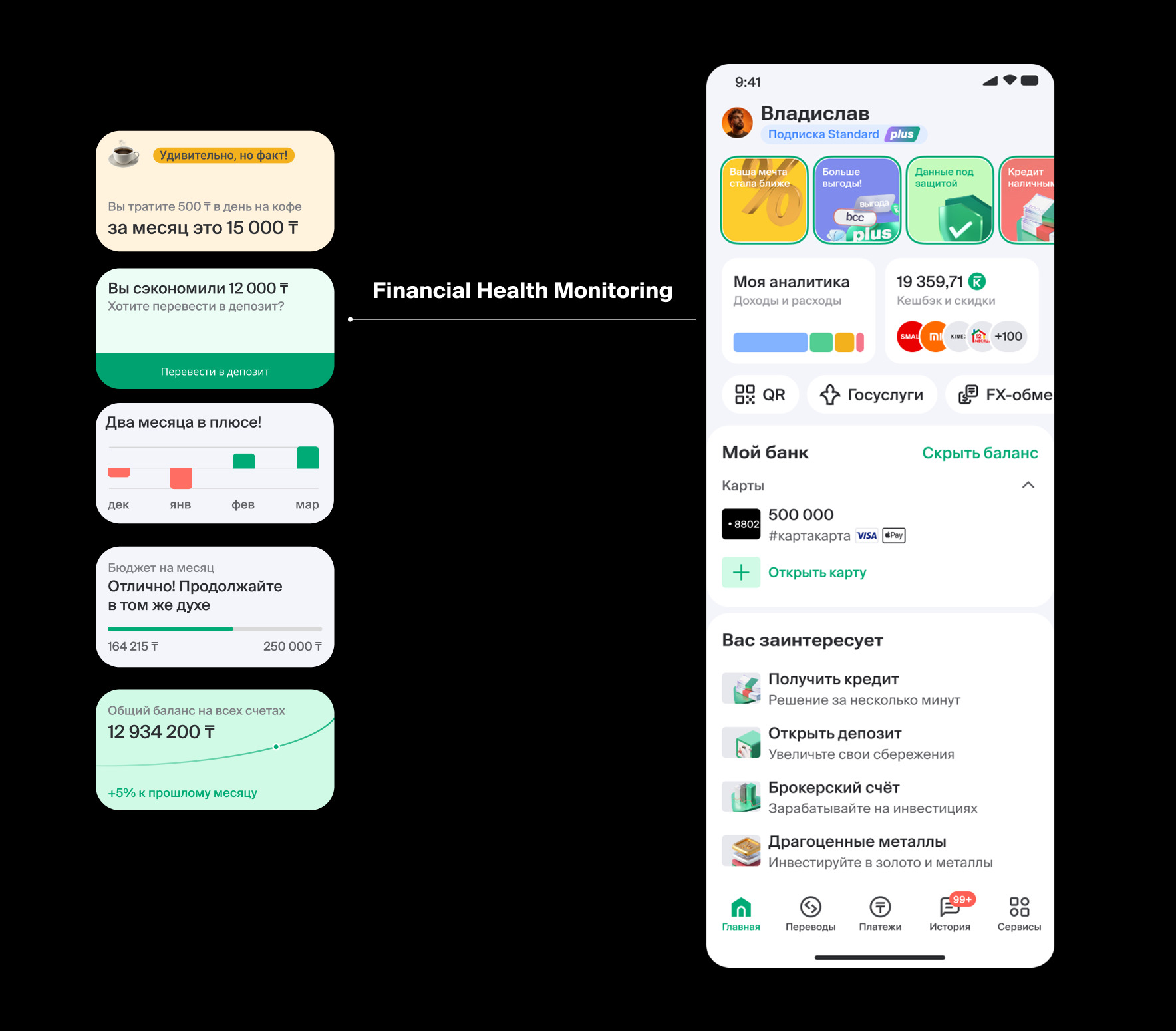
- My Analytics (income/spend) and a loyalty widget (cashback + partner offers + subscription perks) — treating financial control and rewards as two separate value drivers.
- Quick services were then reordered to give more room to low-traffic services; high-demand ones (transfers, payments) moved to the end, as they already have their own tabs in the bottom navigation.
Concept
Early layout
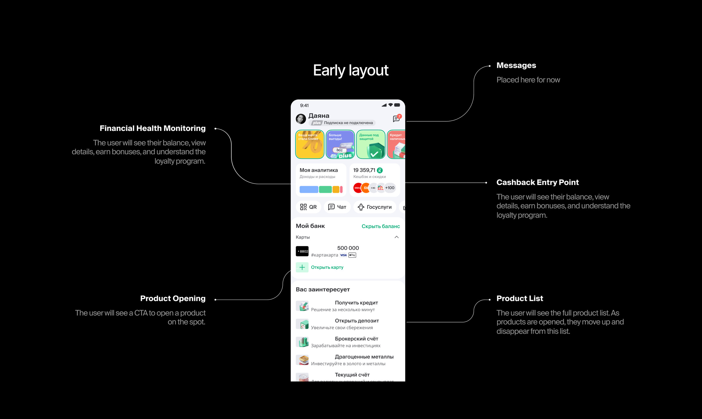
- Financial Health Monitoring. The user will see their balance, view details, earn bonuses, and understand the loyalty program.
- Product Opening. The user will see a CTA to open a product on the spot.
- Messages. Placed here for now.
- Cashback Entry Point. The user will see their balance, view details, earn bonuses, and understand the loyalty program.
- Product List. The user will see the full product list. As products are opened, they move up and disappear from this list.
Built on BCC’s existing design system (no new branding).
The two widgets use distinct 3D-style iconography so users understand each at a glance before reading labels. The analytics widget was designed as the first step toward a modular system — future iterations let users swap a category view and a chart-based view of the same widget.
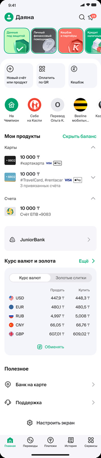
Before/After
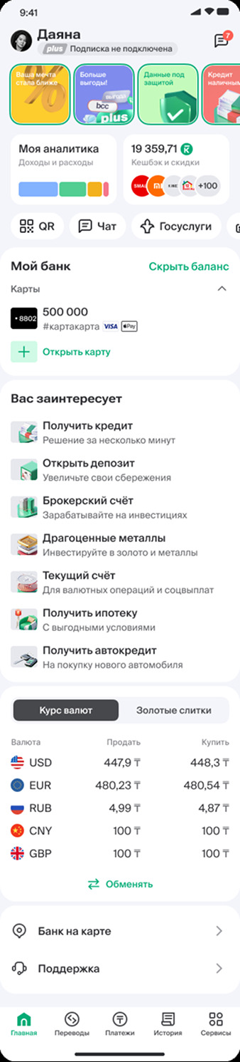
The redesigned Homepage surfaces product opening through a dedicated “You might be interested” section, replacing a small icon buried in a 3-item quick-services row. It shows seven offers: the product categories that dominate Services traffic (the four biggest alone account for ~57% of Services category traffic), plus metal accounts, which we added deliberately to draw attention to a low-audience product. Cashback is now shown as a live, personal value rather than a flat icon. A new “My Analytics” widget gives users a lightweight income/expense preview.
Results
Shipped in v4.36 — July 16, 2026.- 85% vs 20%: found and opened a product from the first screen, new vs old Home (pre-launch test)
- 2.8×: click-through from Home to product pages (1.52% → 4.26%, new vs previous app versions), first ~4 weeks live
- 3.8×: click-through from Home to credits (0.55% → 2.08%)
- Applications mostly flat. Only credits grew in starts (+28%); issued cards +0%.
- Low-base products grew most: mortgages, investment and metal accounts, auto loans.
- Widgets: PFM visits spiked then fell, but interaction inside the section doubled. Cashback visits fell, likely because the balance now shows on the widget.
- Not measured: faster key tasks, cashback retention, reduced reliance on Services. Not in this report: products per client, time in the app, Home MAU (the PO’s target metrics).
- Success criterion (partly met): Home is now a real entry point to products; openings grew only for credits.
What didn’t work: moving low-traffic services up didn’t grow them (gov services, FX). - Caveat: 100% rollout, no control group, ~4 weeks. The numbers are directional, not causal.