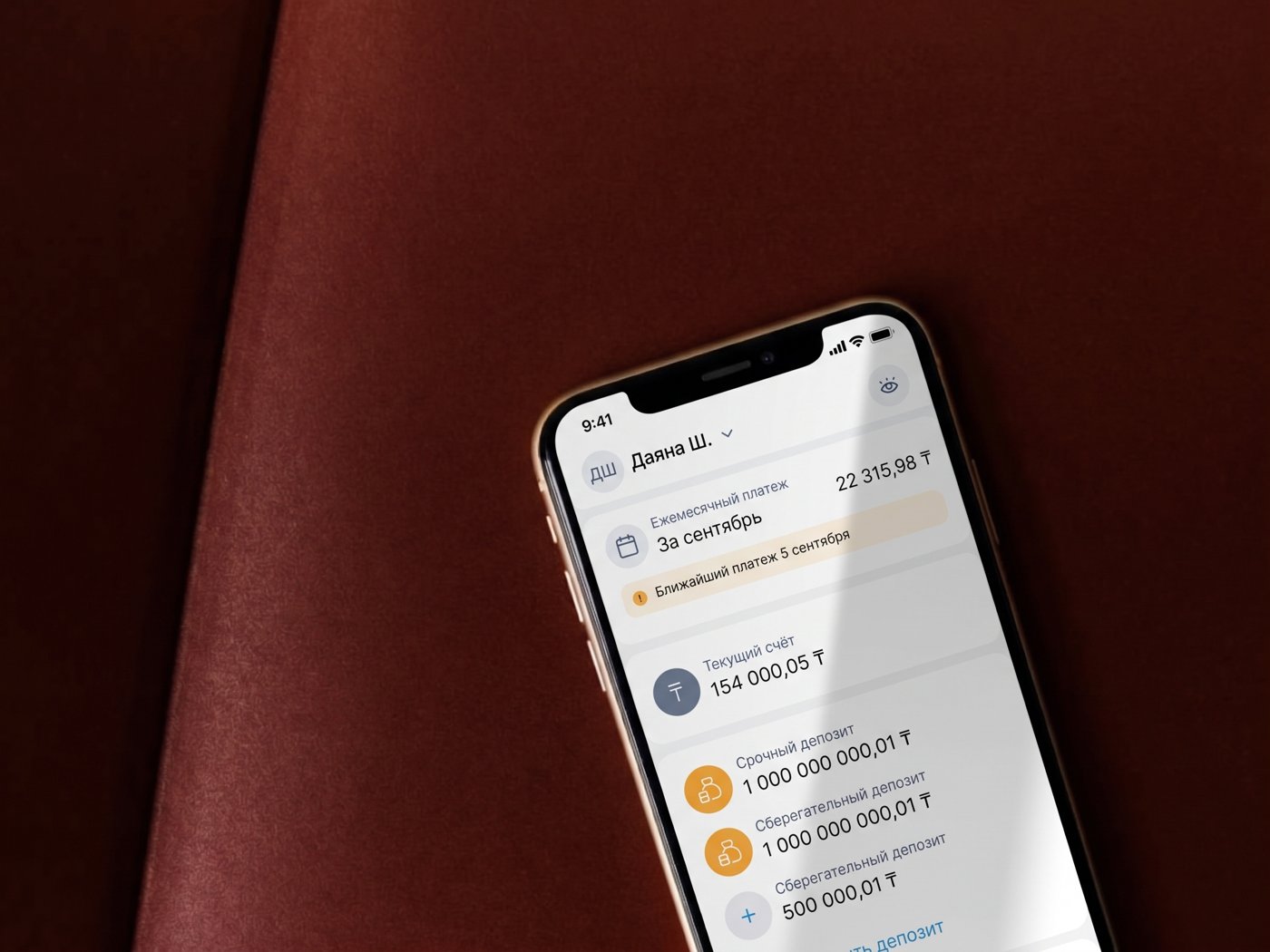
Multi-Loan Repayment Redesign
Redesigning a core lending experience at KMF in the middle of its transformation from Kazakhstan’s largest microfinance organization into a bank.
About KMF – Kazakhstan’s largest microfinance organization, historically focused on lending to micro and small entrepreneurs, including rural and agricultural businesses. In 2024, KMF began its formal transformation into a licensed bank, a process it completed in August 2025 as KMF Bank.
Context
KMF Pay is the bank’s existing system for handling all repayment channels – accounts, loans, and deposits – and it already technically supported paying multiple loans at once. But the experience carried a confusing quirk: a loan only registered as repaid on the day the payment was actually made, with an optional scheduled payment layered on top – creating ambiguity for users about when a payment “counted.”
KMF’s clients are micro and small entrepreneurs, many in rural or agricultural sectors. About 16% of them (~43,000) hold two or more active loans. For them, telling loans apart and paying several at once is the main source of friction. The rest hold a single loan and skip selection entirely.
The project’s only real constraint was working within KMF’s existing design system.
Task
The brief was to redesign multi-loan repayment end to end, from loan selection through payment to confirmation. About a quarter was allocated for design. The goals were to reduce payment-related support inquiries and increase use of the multi-loan flow.
I started with benchmarking nine banks across Kazakhstan and the CIS, developed concepts from it, and validated them in usability testing. The test’s own success metric (completion time and success rate) was used only to choose between prototypes, not as the project’s overall measure of success.
Benchmarking
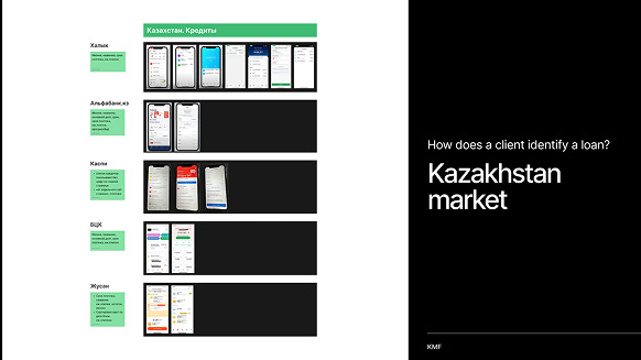
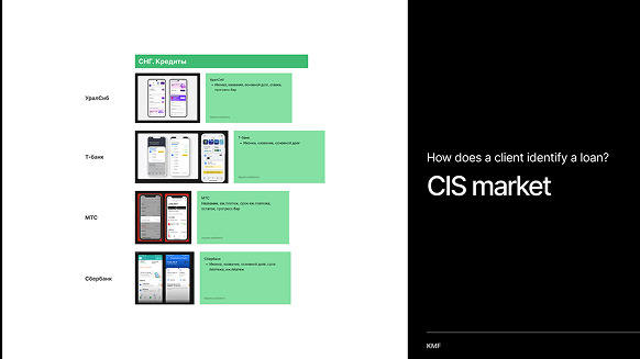
Before designing anything, the existing multi-loan repayment experience was benchmarked against nine banks across Kazakhstan (Halyk, Alfabank.kz, Kaspi, BCC, Jusan) and the CIS region (UralSib, T-Bank, MTS, Sberbank) – mapping exactly what information each bank surfaced per loan, and how each handled paying multiple loans at once.
A detailed feature comparison across eight of those banks produced a clear pattern: loan name appeared universally, while principal debt, payment date, and monthly payment amount each appeared in roughly five out of eight – common enough to be expected, but not universal enough to take for granted. A progress bar and interest rate were far rarer. This became the evidence base for which fields actually belonged in KMF's own loan cell, rather than guessing.
One competitor stood out clearly from the rest, distinguished by three qualities: a single calendar date for all payments, same-day settlement with no scheduled lag, and loan agreements that zeroed out rather than formally closing once paid off – a benchmark worth aiming for, even if not every detail was replicable within KMF's own systems.
Because clients with several loans need to tell them apart at a glance, I put the fields most banks show into the loan cell: loan name, principal debt, payment date and monthly payment. Progress bar and interest rate, which were rare, I left out.
User Stories
Concepts
Five initial concepts were explored, each varying which fields appeared in the loan cell and how selection worked – informed directly by the benchmarking data on what information actually mattered to users. These were narrowed down to two distinct prototypes, each representing a different interaction philosophy rather than minor visual variants:
Prototype 1 – List menu. Every loan shown as an individual row with its own checkbox, more information visible on screen at once, and fewer taps required to select and pay.
Prototype 2 – Dropdown menu. A collapsed summary ("2 loans, ₸20,000.98") behind a single dropdown, trading a cleaner, less crowded screen for more taps to get through the same task. Its editable "Payment amount" field worked like a calculator: a partial amount was automatically applied toward whichever loans were nearest their due date first, replicating the logic a person would use manually.
Rather than debating which felt more "modern," both were built as real, testable prototypes – setting up the research phase to settle the question with data instead of opinion.
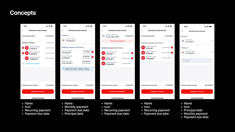
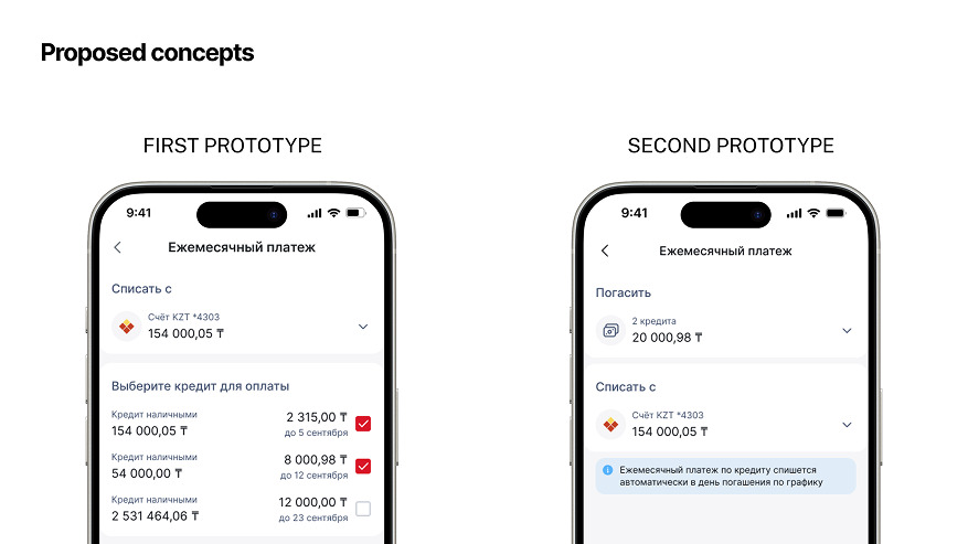
I dropped Prototype 2’s editable amount field. Partial payment is available from the individual loan, so the multi-loan flow stays focused on paying full amounts.
Research & Testing
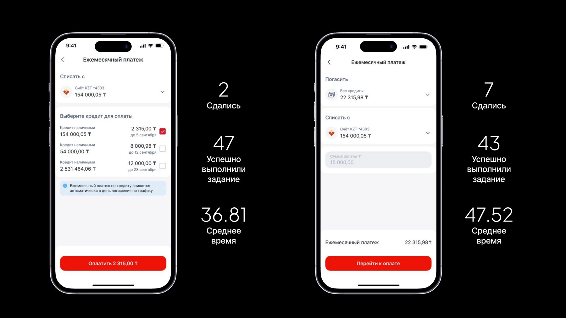
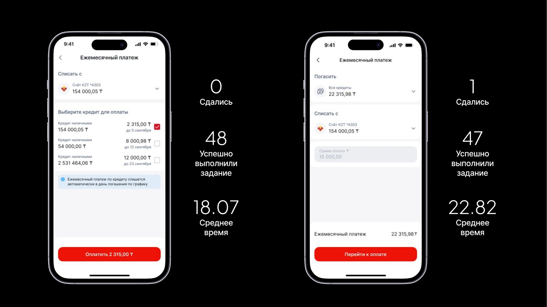
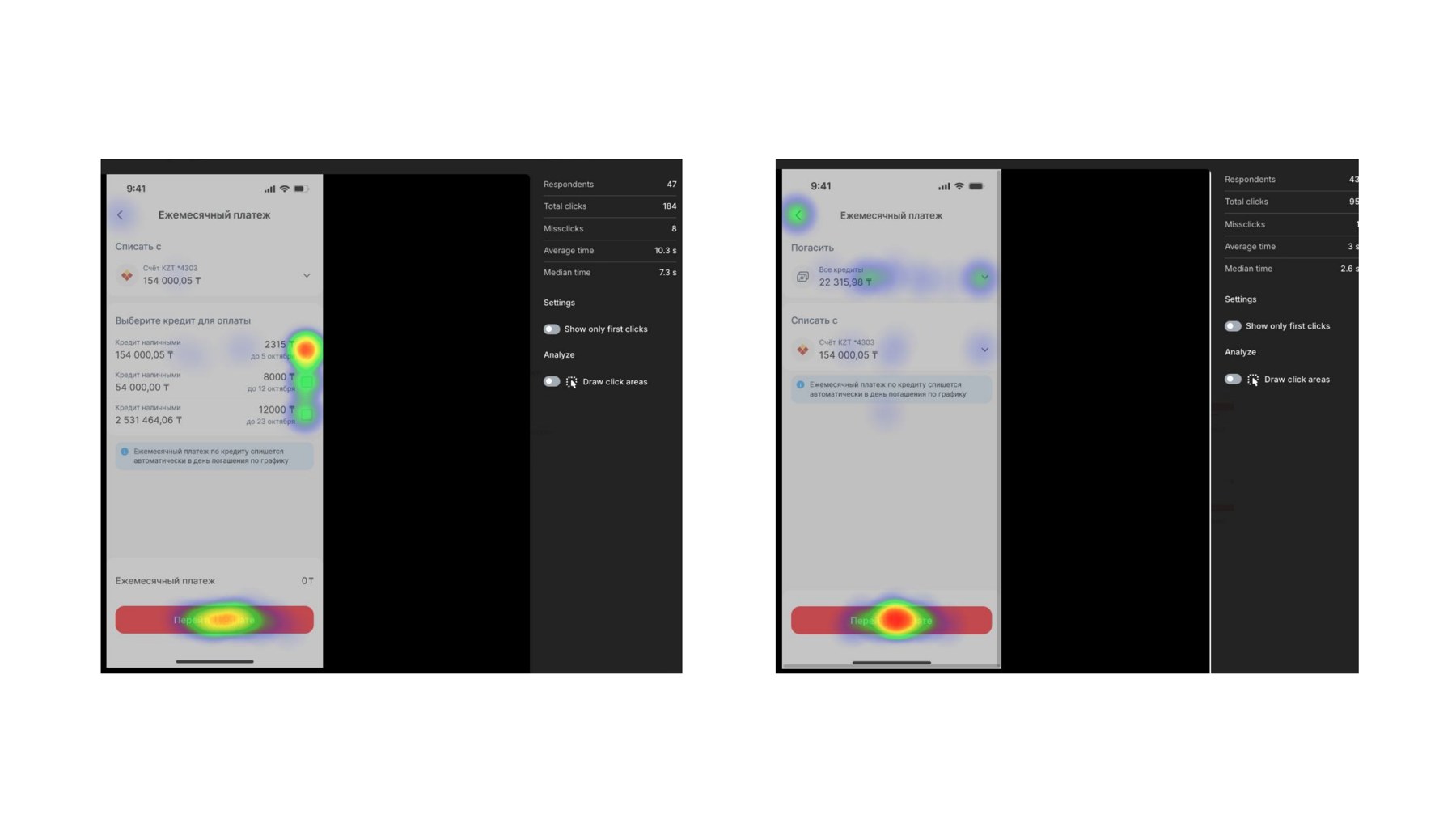
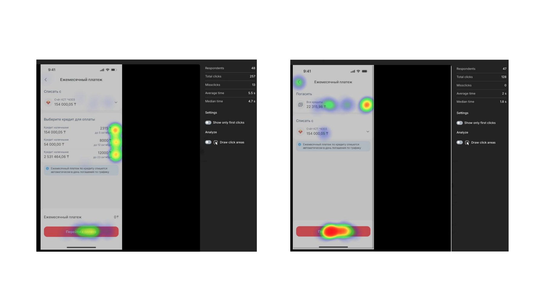
Two prototypes were tested head-to-head with roughly 50 respondents over two days, using two representative tasks: paying only the loan nearest its due date (requiring the user to correctly identify one loan among several), and paying the monthly amount across all loans at once.
Prototype 1 Winner
List menuPrototype 2
Dropdown menuInterestingly, the design-satisfaction survey told a slightly different story than the task data: Prototype 2 scored marginally higher on perceived visual quality despite performing worse functionally – a reminder that "feels cleaner" and "is easier to use" aren't always the same thing, and why testing both mattered more than picking a favorite on instinct.
The test ran before release. All KMF employees were invited by internal email, and about 50 took part. They are not the rural entrepreneurs who use the app, so I treat the results as a signal about the interface, not about the audience.
Task 1 shows the real gap: 96% of users succeeded with the List menu against 86% with the Dropdown (2 vs 7 gave up). In Task 2 the difference is small for a sample this size.
Analytics
Beyond the interface itself, real usage data shaped how much complexity the design actually needed to support.
of active clients hold 3 or fewer active loans at once
| Active loans | Clients |
|---|---|
| 1 | 228,525 |
| 2 | 40,162 |
| 3 | 2,330 |
| 4 | 487 |
| 5–9 | 438 |
| 10–14 | 14 |
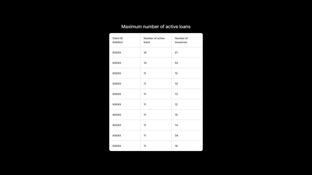
A long tail of edge cases extends up to 14 loans held by a small number of outlier clients – giving a clear, evidence-based target: the design needed to handle a handful of loans gracefully as the default case, while not breaking under rare extremes.
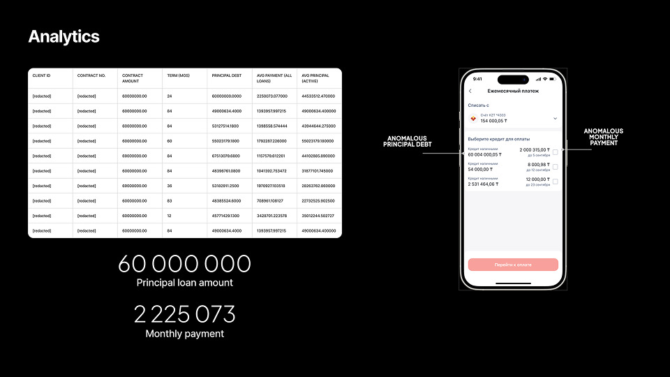
That edge-case thinking mattered in practice – a review of production data surfaced an anomalous account with a principal debt over ₸60 million and a monthly payment above ₸2 million, values far outside typical ranges. Catching this kind of outlier early meant the interface needed to handle unusually large numbers without breaking layout or legibility, rather than assuming all values would stay within a comfortable range.
Final Solution
The final flow shows each loan with its name, principal, payment date and amount, and marks overdue loans with penalties included in the amount. Users can pay all loans at once or select one; the total updates automatically. A client with a single loan skips selection. If the primary account lacks funds, the user can pay by a card from another bank. After payment, an inline notification confirms it, and the loan page shows a “payment made” mark.

Results
Shipped & liveMulti-Loan Repayment shipped and is live in the KMF Bank app. I don’t yet have post-launch data on support tickets or adoption, so I can’t quantify the effect. What I can show is the pre-launch evidence: in testing with about 50 employees, the List menu beat the Dropdown on both tasks, especially in finding the nearest-due loan (2 vs 7 gave up).